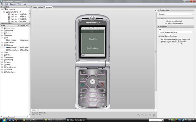
With the need for information "on the go", designing a web site for diverse devices is essential. We can no longer expect users to view web sites on a 15 to 22" monitor, users are using such devices as a PDA. a cell phone, and/or even refrigerators. As more people are accessing their information via a mobile device, the demand for handheld compatible web interfaces grows.
The standard screen size of a handheld is 160x160 pixels, minus title and scroll bars, leaving only 150x140 pixels of usable screen. When designing such a small interface, every pixel counts. Rather than using large, detailed elements, it is important to think about how graphics can be used in a PDA design. Handheld users sync their information on the go and don't want to be bogged down waiting for large graphic files to download. So, for example, easy-to-read, high-contrast icons might be more effective than larger, more intricate icons with labels such as home, contact, search, etc.
Keep page length to a minimum and try to avoid horizontal/vertical scrolling, as the scrollbars not only take up space, but also make the page less user friendly. If possible, do not present more than one topic per page. It's best to provide links within the content so the user can scroll down for additional details. Keep in mind that you're developing for a "mobile" device, meaning the users may be unable to focus their full attention on the screen. Present the content as obviously and simply as possible. Be sure to provide easy access to a site map or table of contents so the user can get re-oriented if they get lost.
It's important as a web designer to keep up with mobile device interface design, especially since they will likely contain smaller interface screens to keep up with busy lifestyles we lead.
| SS Media Types | |
|---|---|
Media Type |
Description |
all |
Used as the default media type by CSS if nothing else is specified. As a result, any device accessing the site will use this style sheet to render the contents of the page. |
braille |
Used for Braille tactile feedback devices. |
embossed |
Used for Braille printers. |
handheld |
Used for handheld devices, such as PDAs and cell phones. |
print |
Used for printing and print previews. |
projection |
Used for projectors. |
screen |
Used for computer displays. |
speech |
Used for speech synthesizers There is a complete section of the CSS specification intended for aural representation of data. |
tty |
Used for Teletypes and other devices intended for the hearing impaired. |
tv |
Used for television displays, such as Microsoft's WebTV. |
Attaching a Printer-Friendly Style Sheet:
The printer is the easiest device to design for. To see what a web page will look like on a printer, you must do a Print Preview from your web browser. A print-media style external sheet is attached to a web page. A style sheet must be formatted according to how you will want it to show in the browser and then attached. The best example is to name the style sheet print.css since it will be viewed from print media. Attaching it is completed by going to Window > CSS Styles and clicking the Attach Style Sheet button, which would the print.css file.
Styling for Print:
The Style Rendering Toolbar is essential in styling for print. It allows you to switch the display to different media style sheets in Design view. The different media styles are screen, print, projection, TV, handheld, and TTY. A CSS Rule is created to show the items that should be hidden when in the different media styles. The CSS Rule only applies to the print-media style sheet, not the main style sheet. Basically the items that are blocked from viewing on a handheld, for example, or not printed are navigation, logos, footers that contain navigation and copyright information. These items are unnecessary and take up space when viewing on a handheld device or viewed on a projection screen because you aren't going to be navigating from page to page or needing the information in the footer. Logos can take up room on a handheld, thus are deemed unnecessary.
Accessing Adobe Device Central:
Adobe Device Central is very helpful for designers to view the web pages they develop and how they will be rendered on different devices. Device Central constantly updates device profiles. Adobe Device Central is bundled within Dreamweaver and can be accessed by going to File > Preview in Browser > Device Central. In the Available Devices pane, you simply select the type of phone you wish to view your page thru. You are able to scroll through the page. A great tool to have for the modern world. To update your version of Device Central, you are taken to Device Central Online once you choose Devices > Check for Device Updates.
